In a culture where the color grey has become synonymous with “neutrality” or “versatility,” it is very easy to lose emotion, depth, and meaning. But at Modificat studio, we believe: any color can sound beautiful if chosen with soul and an understanding of the space.
Grey has long been a favorite of designers. It is restrained, universal, and neutral. But to be honest, in real interiors, it is often used thoughtlessly. As a result, instead of sophistication, we get the “windowless office effect”: cold, flat, without life.
When Grey Doesn’t Work
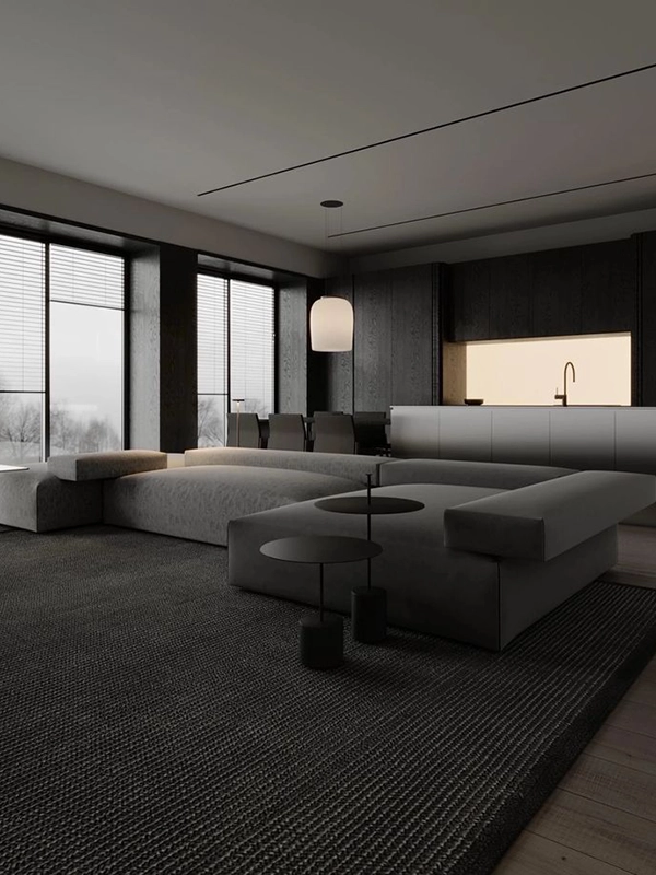
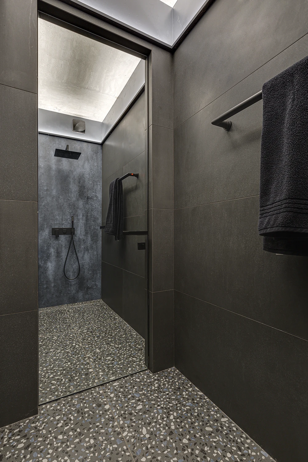
The most common mistake is the use of total grey, which creates an interior without depth. Grey walls, grey furniture, grey textiles, and flooring — all in one shade and without nuances. In such a space, it’s hard to feel “at home”: it’s not cozy, not emotional, and indistinct.
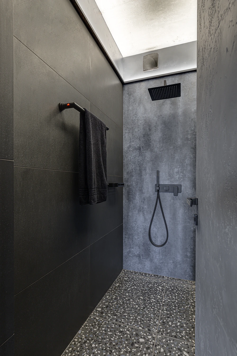
Another problem we often notice is an incorrectly chosen shade of grey. Warm or cold, with purple, green, or blue undertones — all of this is critically important. Grey comes in many forms, like morning fog in the mountains, warm stone on the coast, or the first sky after rain. In poor lighting, grey can “turn grey,” give off green, or make the residents’ skin look dull, as if in hospital light. In our latitudes, instead of elegant restraint, you can get fatigue, depression, and a desire to escape from your own home.
Попри свою популярність у мінімалістичних інтер’єрах, сірий колір у великих об’ємах не такий вже й “спокійний”. Особливо, якщо мова йде про клімат із хронічним дефіцитом сонця. У наших широтах, де зима триває по півроку, а небо часто затягнуте хмарами, сірий в інтер’єрі не врівноважує, а підсилює загальну “приглушеність” і апатію. Додайте до цього ще одноманітне освітлення і ризик емоційного виснаження зростає в рази.
How We Work with Grey at Modificat
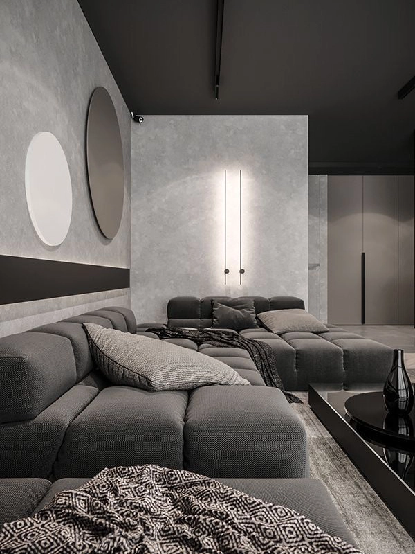
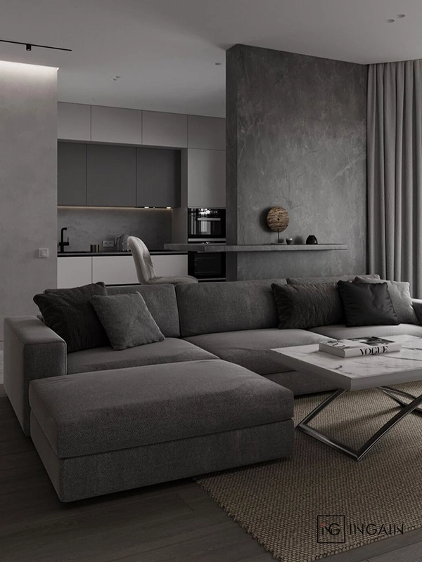
We do not reject grey and have implemented more than one interior with this color over the years. It is a backdrop for depth, for shadows, for emotion. And if you work with it subtly, it plays like silk in the sun.
We never leave it “bare” because it always works in a duet with:
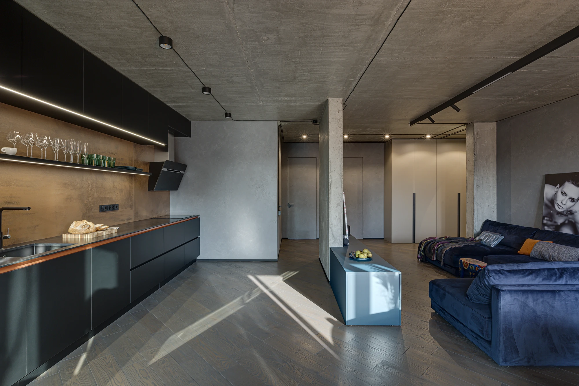
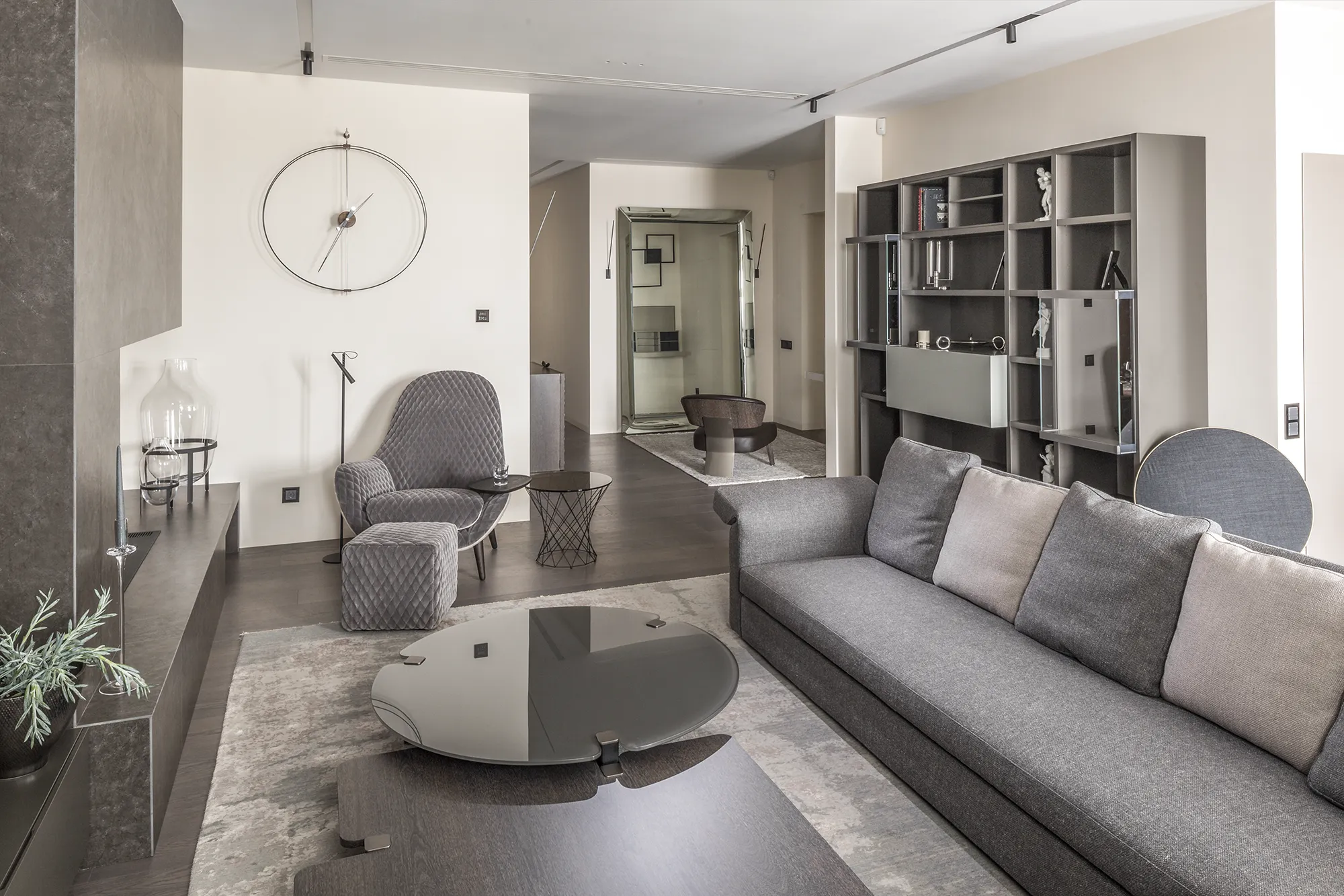
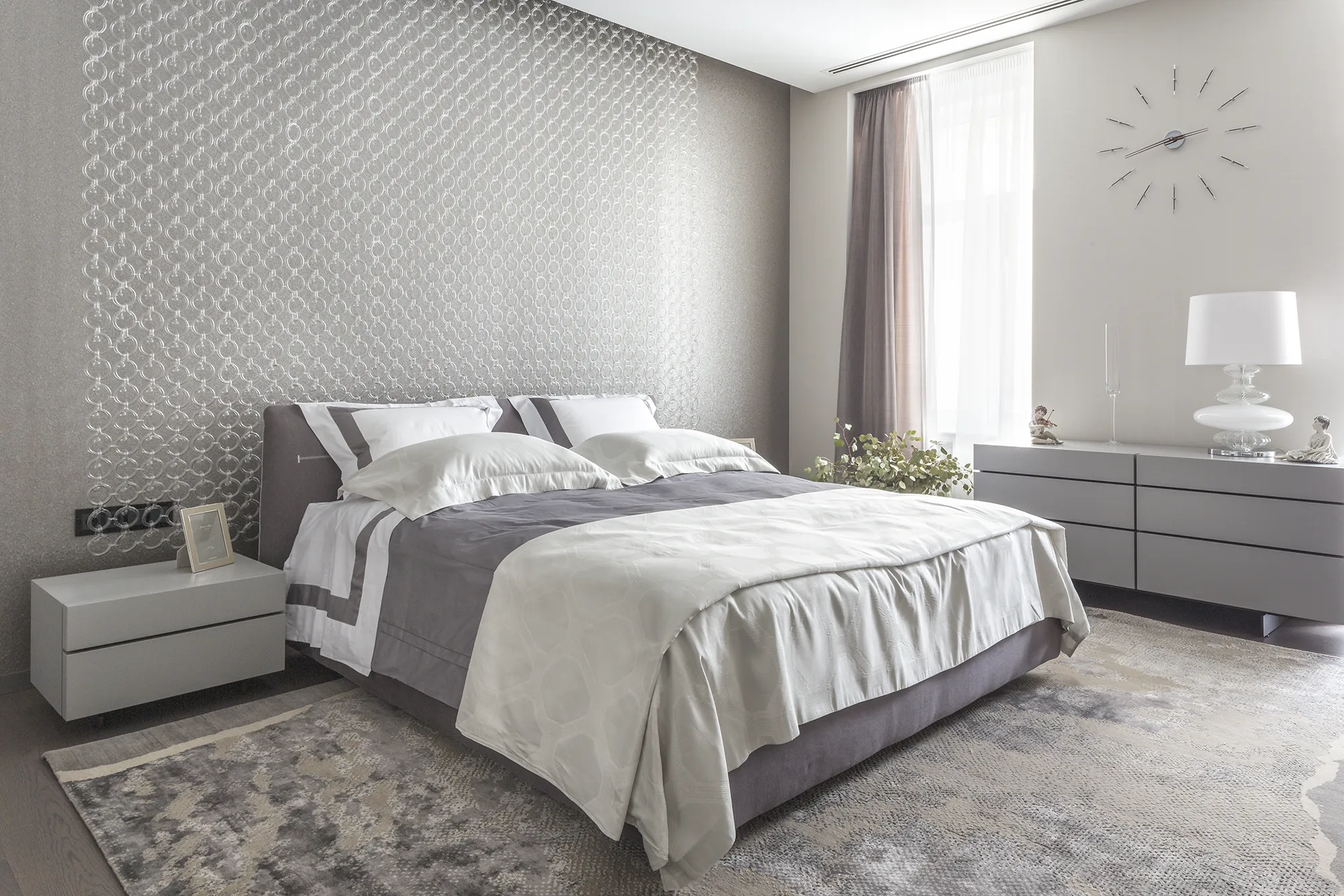
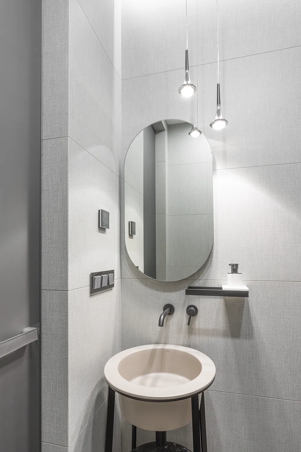
In our Modificat design studio projects, the color grey is like silence in music: it is needed to reveal the loud notes. That’s why grey in our interiors doesn’t look boring; it creates balance, emphasizes form, and highlights what is important.
What Can Replace Grey?
At Modificat, we don’t fight grey, we look for meaning behind every choice.
Our brain craves stimuli, but “soft” ones, not screaming ones. Psychologists have long established that the visual environment directly affects energy levels, motivation, and even the ability to concentrate. Prolonged stay in an environment without visual accents, subdued light, a cold palette, and grey walls can cause fatigue, irritation, and even a decrease in mood. This is especially true for those who work from home or spend most of the day indoors.
If grey is chosen to “be calm,” we always ask the question: what is calm for you? For some, it’s warm beige, for others, it’s foggy blue, for some, it’s green, like in a spring forest after rain.
We don’t work with templates, but create interiors that reflect your inner state, your style, and your habits. And if grey fails to cope with this task, we help find colors that resonate deeper. Not bright for the sake of brightness, but personal, precise, and alive.
Grey is not the enemy of the interior, but it is not a magic wand either. Without nuances, it quickly becomes cold and impersonal. In the hands of an experienced designer, grey becomes a noble base for a deep, emotional space. At Modificat studio, we know how to work with grey and know exactly when it is best to apply it.
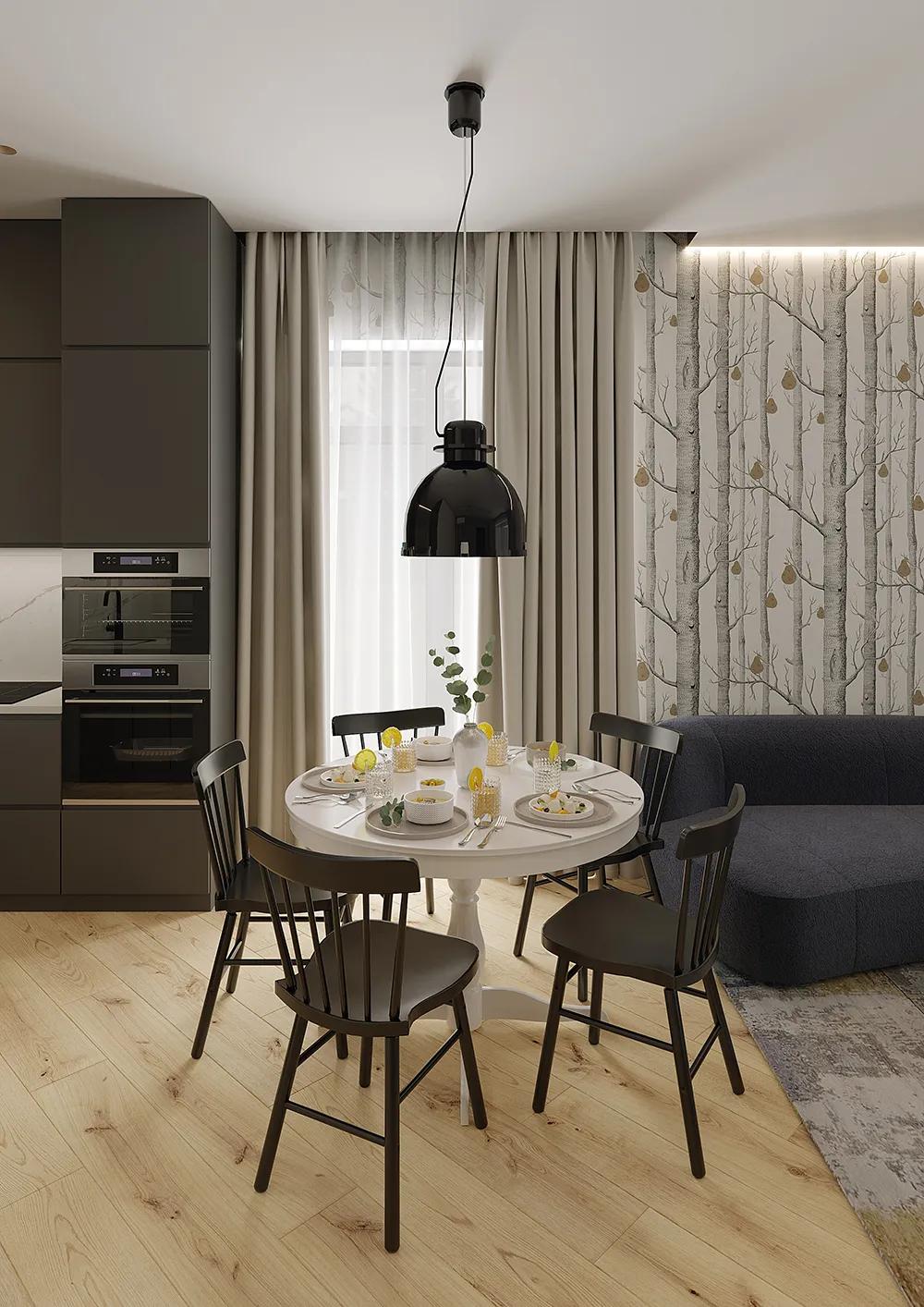
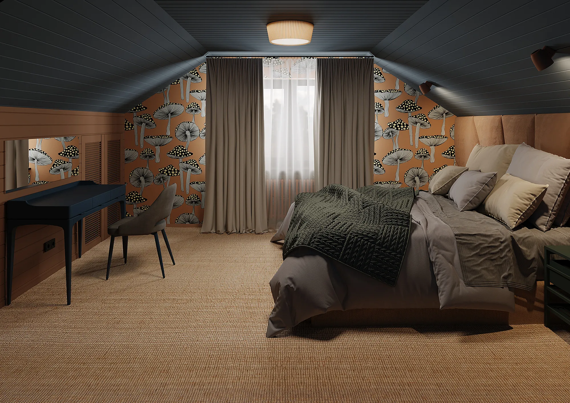
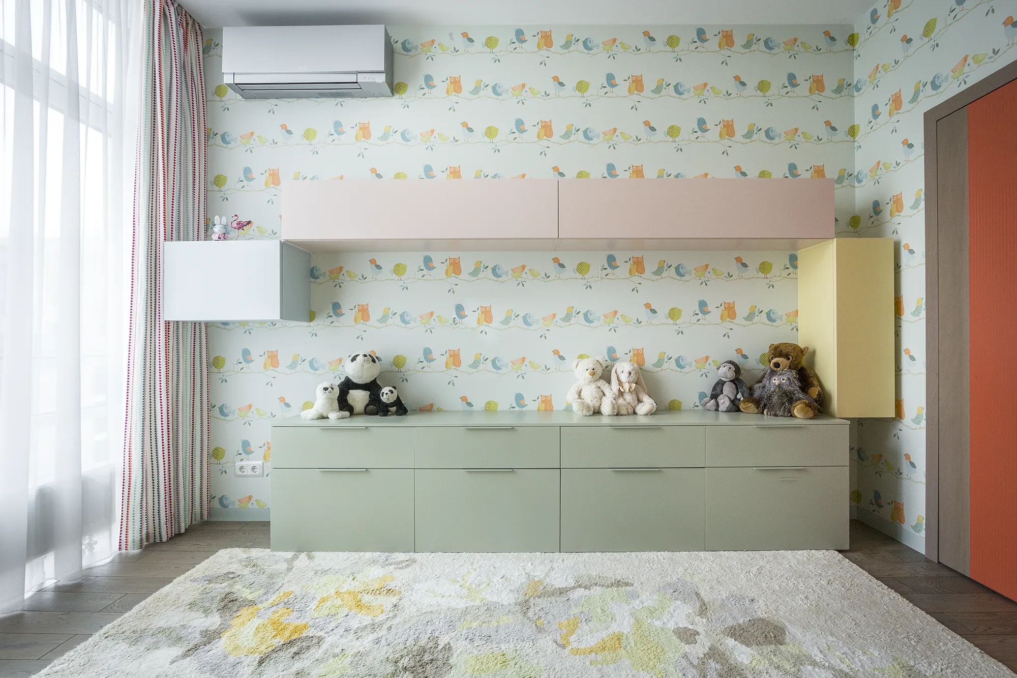
Наш проєкт “Оранжеві тропіки”, що є прикладом виключного поєднання теплих кольорів та текстур, що виступають на противагу сірим трендам.
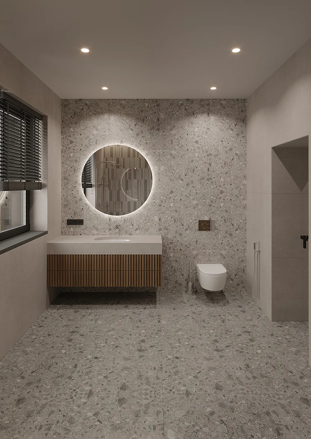
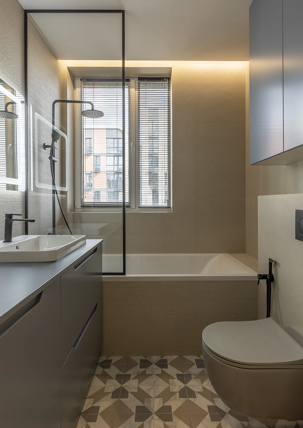
Створити не плаский сірий допомагає професійний підхід дизайн студії Modificat до комбінаторики оздоблювальних матеріалів, текстилю і навіть самого сірого кольору.
Want to know which colors will make your space truly alive? Write to us. We will talk about your feelings, not about “fashionable or not.”