or why you shouldn’t build an interior around fashionable images
Fashion changes faster than the paint on the walls has time to dry. But an interior is not an outfit for one evening. It is your daily reality, and it must be not only beautiful but also convenient.
So, let’s talk about those trends that often fail the test of life.
So, let’s talk about those trends that often fail the test of life.
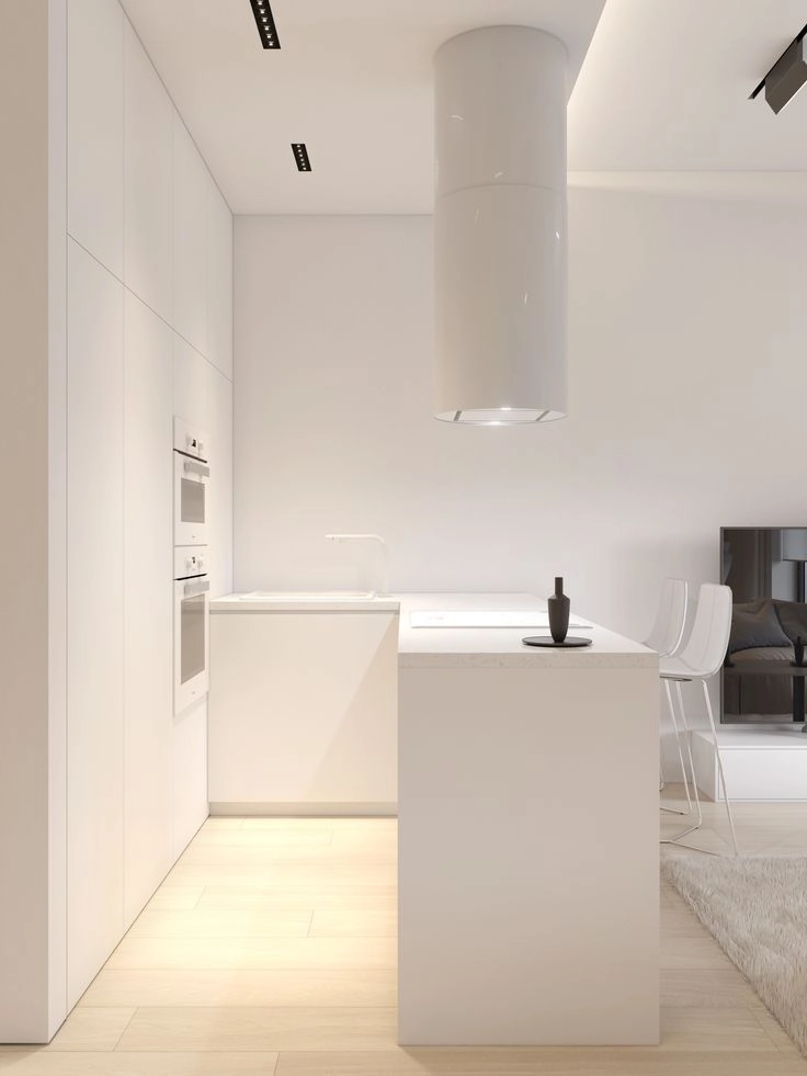
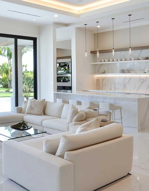
Trend 1. White on White
White is certainly a universal color. It is associated with purity, space, and light. That’s why the “white on white” trend appeared (and lasted for a long time): walls, ceiling, floor, furniture, textiles — all in one shade. Such interiors look spectacular in photos, but, unfortunately, they almost never withstand the test of real life.
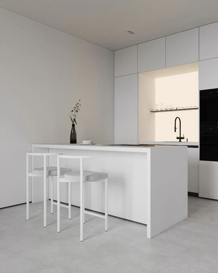
Why does the “all white” idea look beautiful only in pictures?
1. Requires ideal discipline
1. Requires ideal discipline
White quickly loses its “sterile” purity: a coffee stain, fingerprints on gloss, grey dust, scratches — all of this instantly becomes noticeable. Such interiors require constant care, special detergents, and frequent washing of textiles. Agree, not everyone wants to live in cleaning service mode.
2. Can look cold and lifeless
2. Can look cold and lifeless
Solid white, without textures, natural shades, and depth, easily turns a home into a hospital or a showroom. A person needs sensory anchors — something that visually and tactilely creates a feeling of “warmth,” belonging, and comfort. A snow-white space often looks sterile, and you want to live in an environment that “embraces.”
3. Lacks space for life
3. Lacks space for life
In white interiors, it’s easy to lose a sense of self. They often create an effect of emptiness: every item left out of place looks like a violation of the system. This obliges one to impeccable orderliness, which is almost impossible in a real rhythm.
4. White is not always just white
It is worth mentioning one more thing: white has dozens of shades. If they are chosen incorrectly, the interior risks “falling apart”: one white will seem yellow, another — dirty grey. It is important to work with color precisely, professionally, taking into account light, window direction, and textures.
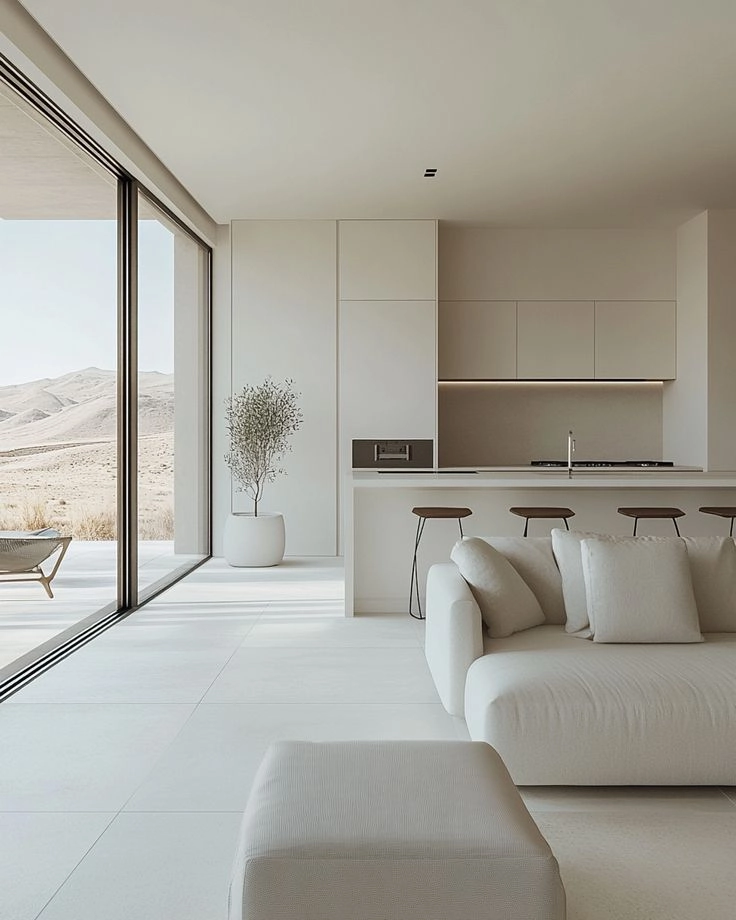
At the studio, we are not afraid of white, but we use it wisely — as a backdrop, as an accent, or as a tool for creating airiness. We always add to white:
Fashion changes faster than the paint on the walls has time to dry. But an interior is not an outfit for one evening. It is your daily reality, and it must be not only beautiful but also convenient.
White can be very refined if it has balance. But as an absolute dominant, it requires either exhibition discipline or a rework after a year.
White can be very refined if it has balance. But as an absolute dominant, it requires either exhibition discipline or a rework after a year.
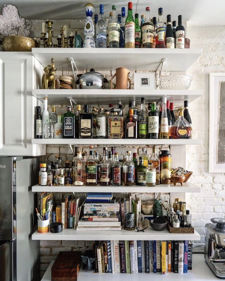
Trend 2. Open Storage
A trend born on social media
Open shelves, displayed dishes, spice jars, stacks of books — all of this looks beautiful in photos. But living among it is a completely different matter. In an interior that functions daily, open storage systems often turn from a style showcase into a field of chaos.
Open shelves, displayed dishes, spice jars, stacks of books — all of this looks beautiful in photos. But living among it is a completely different matter. In an interior that functions daily, open storage systems often turn from a style showcase into a field of chaos.
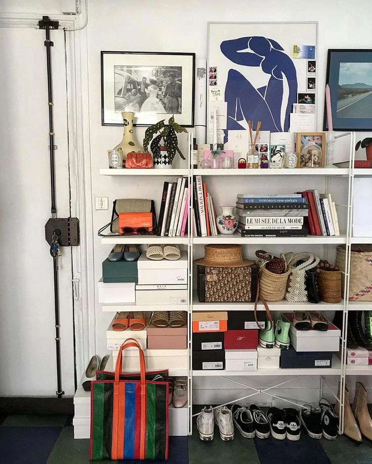
Main Problems:
1. Visual noise
Every item on an open shelf — is a visual accent. Many such objects create an “cluttering” effect, even if everything is in its place. This is especially noticeable in small spaces where it is important to maintain a sense of lightness.
Every item on an open shelf — is a visual accent. Many such objects create an “cluttering” effect, even if everything is in its place. This is especially noticeable in small spaces where it is important to maintain a sense of lightness.
2. Dust and grease
In the kitchen, dust quickly mixes with microparticles of grease and settles on everything. Especially affected are those “beautiful jars” and ceramic plates, which then need to be washed… even if you haven’t used them.
In the kitchen, dust quickly mixes with microparticles of grease and settles on everything. Especially affected are those “beautiful jars” and ceramic plates, which then need to be washed… even if you haven’t used them.
3. Daily burden
Open storage assumes that all items will be visually “neat.” But in reality:
This forces you to either constantly maintain perfect order or live with a feeling of eternal incompleteness.
When open storage can work
ALTERNATIVE: semi-open solutions
Conclusion: Open storage is an example of how a trend can be tempting with aesthetics, but fail the test of real life.
When planning a space, you should not just be inspired by Pinterest, but honestly ask yourself: “Do I want to maintain the ‘picture’ every day?”
When planning a space, you should not just be inspired by Pinterest, but honestly ask yourself: “Do I want to maintain the ‘picture’ every day?”
Маленьку за розміром спальню може “врятувати” вбудована шафа та ліжко із зоною для зберігання.
Створюючи зони зберігання у Modificat, ми ніколи не жертвуємо естетикою, адже вміємо грамотно приховати буденне, та ще й використати собі на користь. За фасадом приховано велику шафу із лічильниками, технікою та полицями, а дзеркало дозволило нам візуально розширити простір.
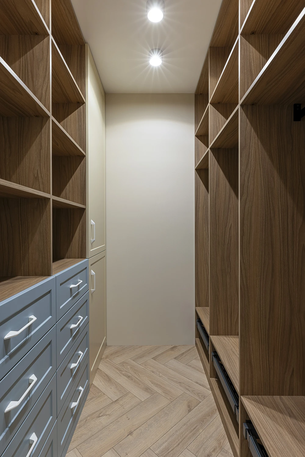
Навіть у маленьких за площею квартирах, можна створити технічне приміщення для зберігання та господарського обладнання.
❕ АЛЬТЕРНАТИВА: розумні системи зберігання, які працюють на вас, а не вимагають натхнення бути вічно ідеальним.
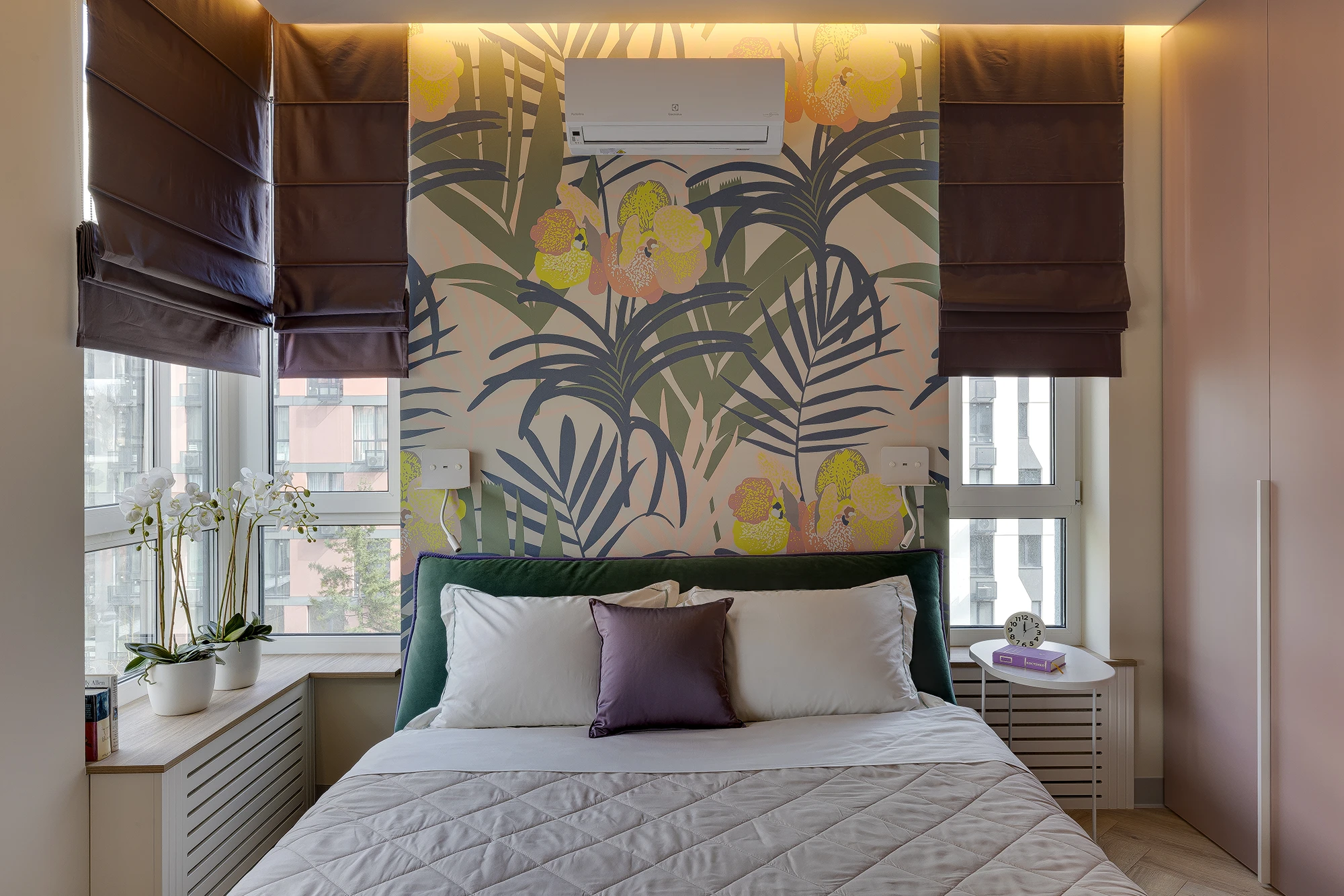
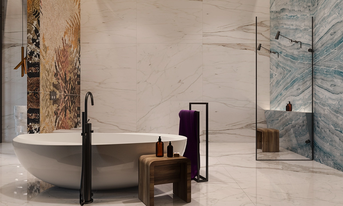
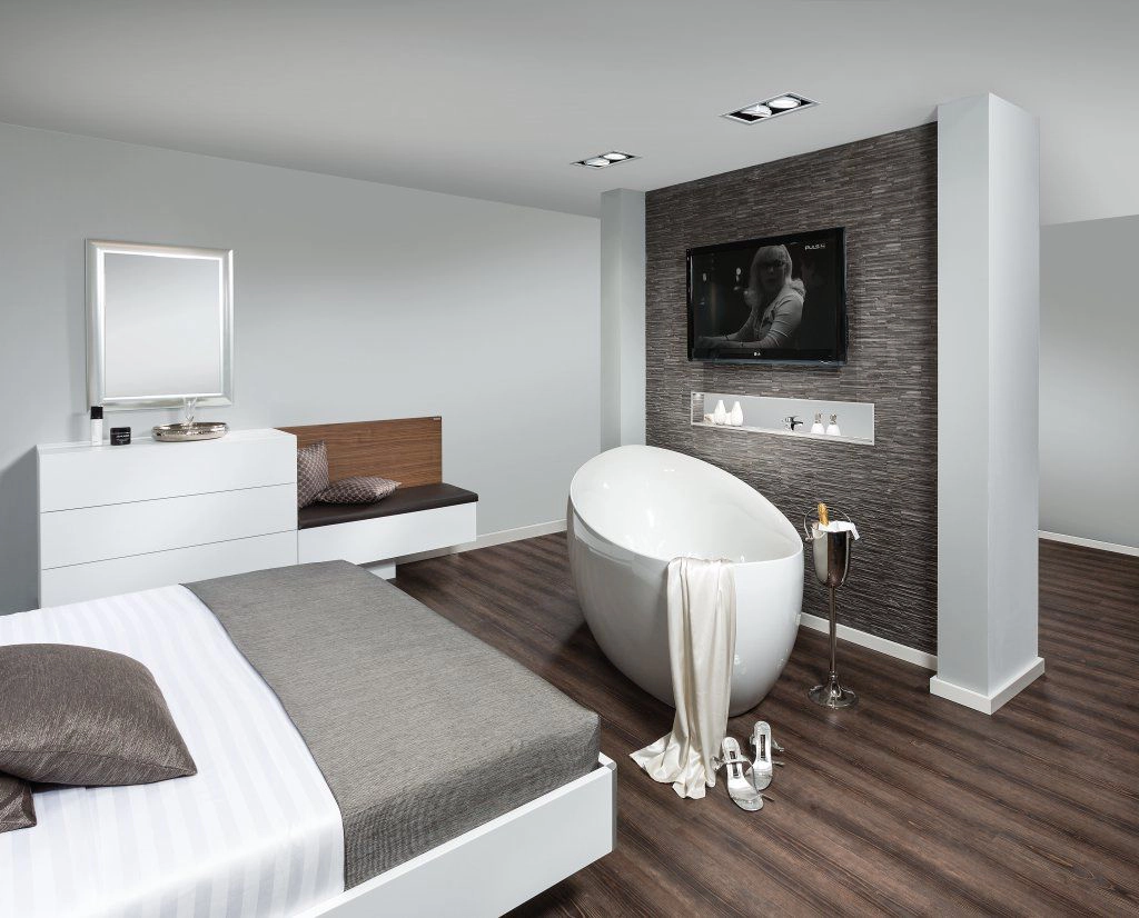
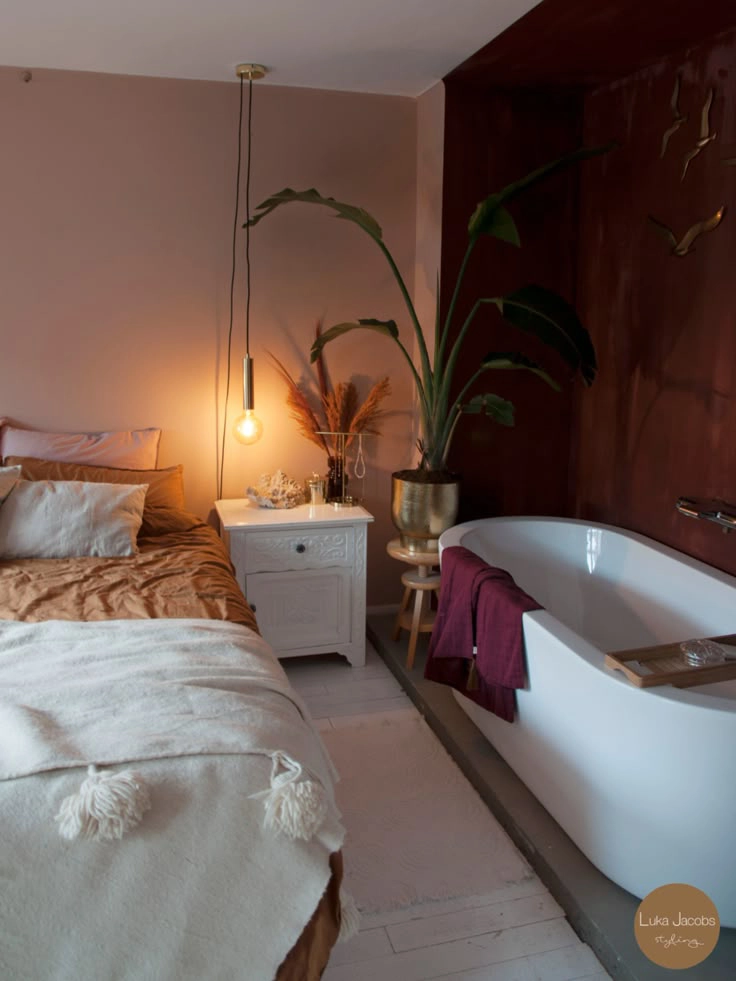
Trend 3. Bathtub in the Bedroom
Yes, a bathtub in the middle of the bedroom looks luxurious. A bit like in a boutique hotel: evening, silence, scented candles, foam, a glass of wine — and all this just a few steps from the bed. A home spa atmosphere? Sounds perfect.
BUT:
1. Moisture is everywhere.
1. Moisture is everywhere.
Even the most aesthetic bathtub does not cancel physics. Steam, moisture, splashes — and all this in a room with textiles, wood, books, and lamps. If there is no super-powerful ventilation, prepare for condensation, fogged glass, and a musty smell.
2. Intimacy disappears.
2. Intimacy disappears.
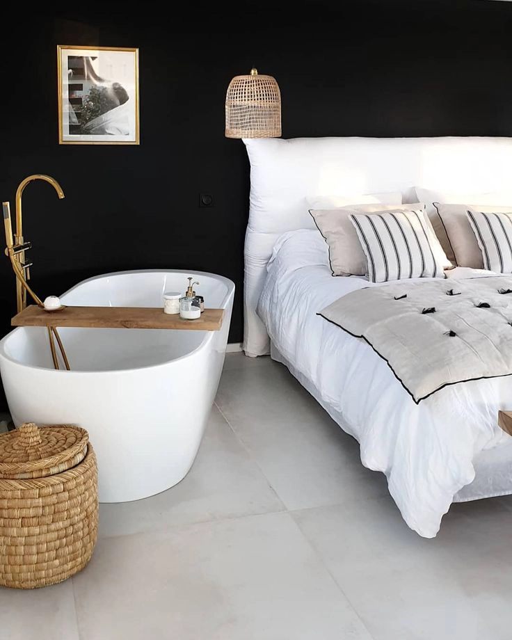
After all, the bathtub is about personal space. Now imagine: one is reading in bed, the other is bathing 2 meters away. Some people are okay with this, others are not. And this needs to be discussed before implementation.
3. Engineering is complex.
Laying pipes, waterproofing, floor level differences — it’s not just “putting a bathtub in the bedroom.” This is a serious technical solution that needs to be calculated already at the project stage. And in some high-rise buildings — also agreed upon.
4. It’s not always practical.
When there is only one apartment, many guests, and the bathroom is actually in the bedroom, this creates inconvenience. Ideally, it is an additional bathtub, for two, and there is another one for everyone else.
5. Constant beautification.
A bathtub in the bedroom is always on display. That is, it must be in perfect condition. Always. Even when hastily getting ready for work or after a difficult day. This is like a bed in the living room: it looks spectacular but demanding of order. This is definitely not for everyone. And not for every apartment.
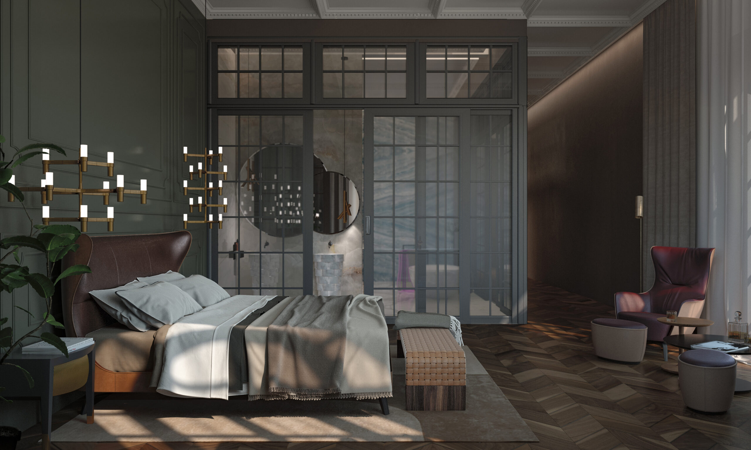
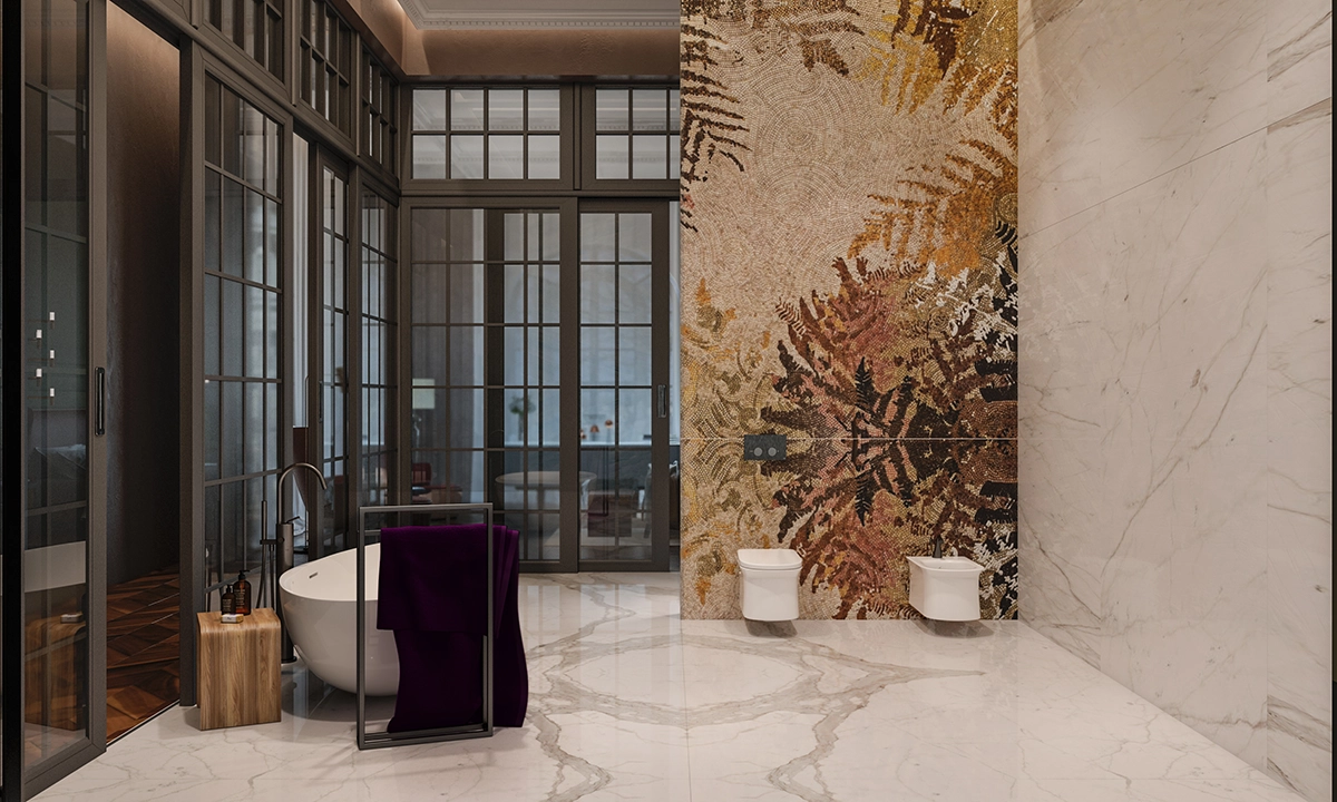
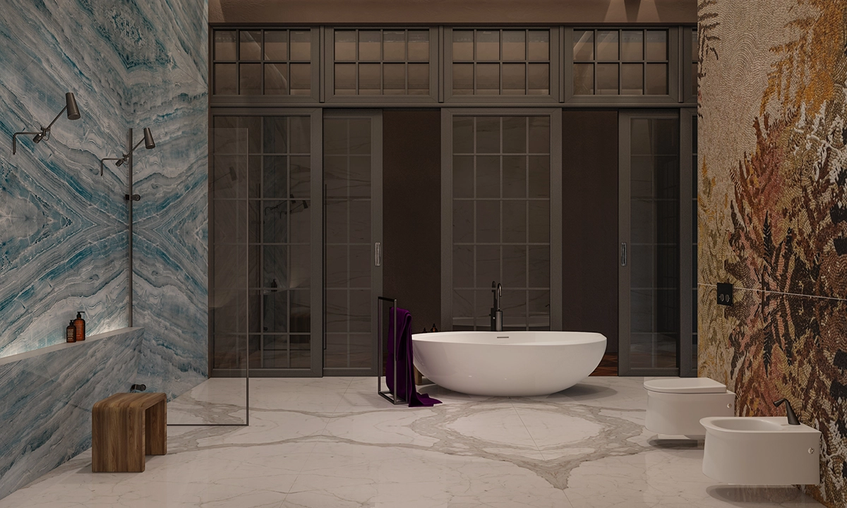
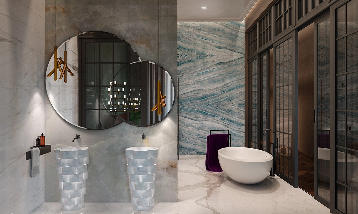
OUR EXPERIENCE: at the studio, we recommend a bathtub in the bedroom only after detailed discussion with the client — lifestyle, habits, technical capabilities. In some cases, we create “hybrid solutions”: a bathtub behind a textured glass partition or in a niche with the possibility of full or partial separation.
CONCLUSION: A bathtub in the bedroom is about image, lifestyle, and readiness to live in an “Instagram” reality every day. If this matches your aesthetics and habits, you can boldly try it. If comfort and practicality are a priority, it is better to leave the bathtub in its usual area. Want a spa effect at home, but without radical solutions? We have dozens of ideas on how to make a bathroom with character — and without compromises.
CONCLUSION: A bathtub in the bedroom is about image, lifestyle, and readiness to live in an “Instagram” reality every day. If this matches your aesthetics and habits, you can boldly try it. If comfort and practicality are a priority, it is better to leave the bathtub in its usual area. Want a spa effect at home, but without radical solutions? We have dozens of ideas on how to make a bathroom with character — and without compromises.
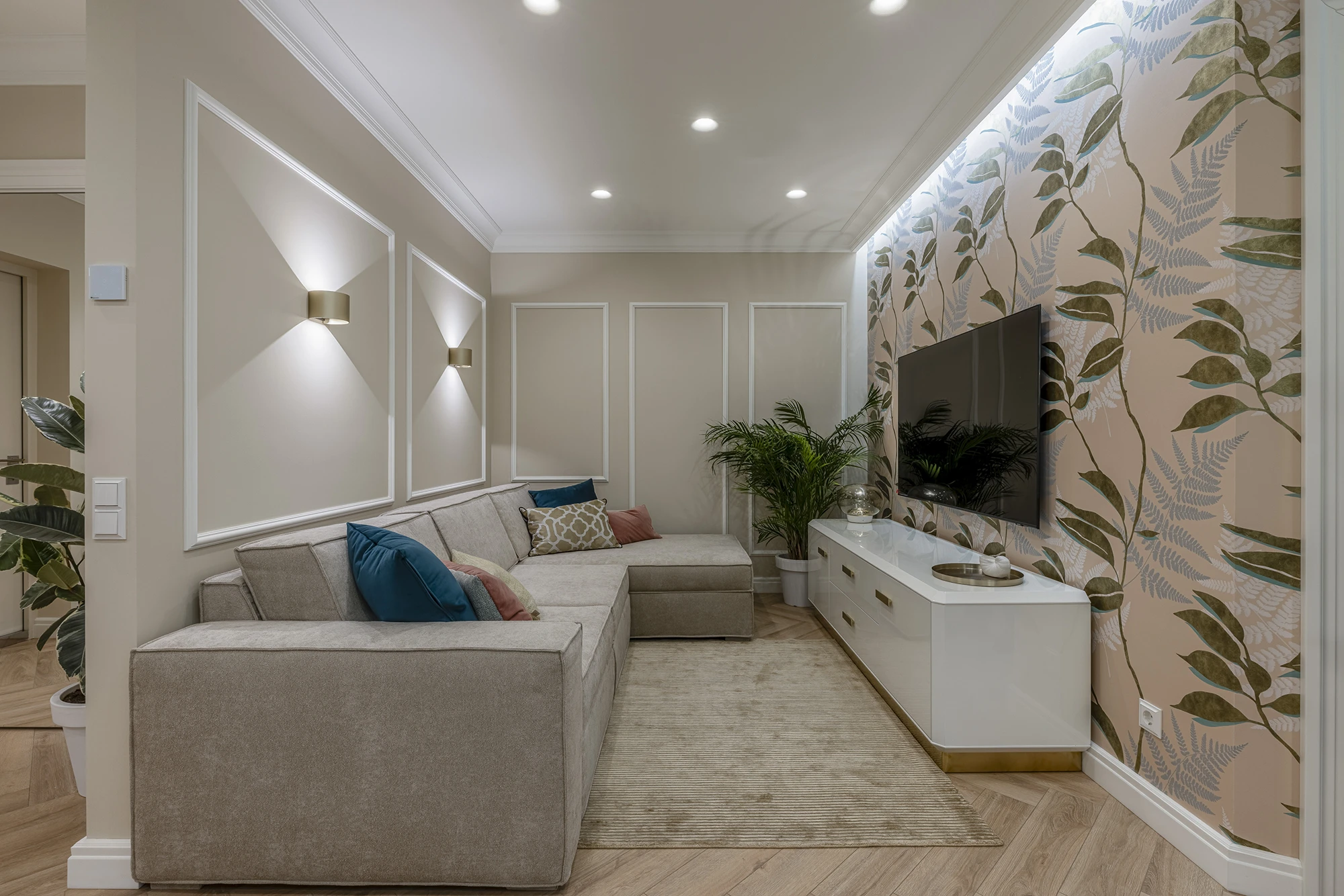
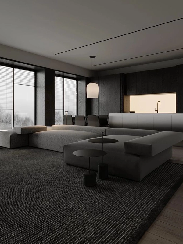
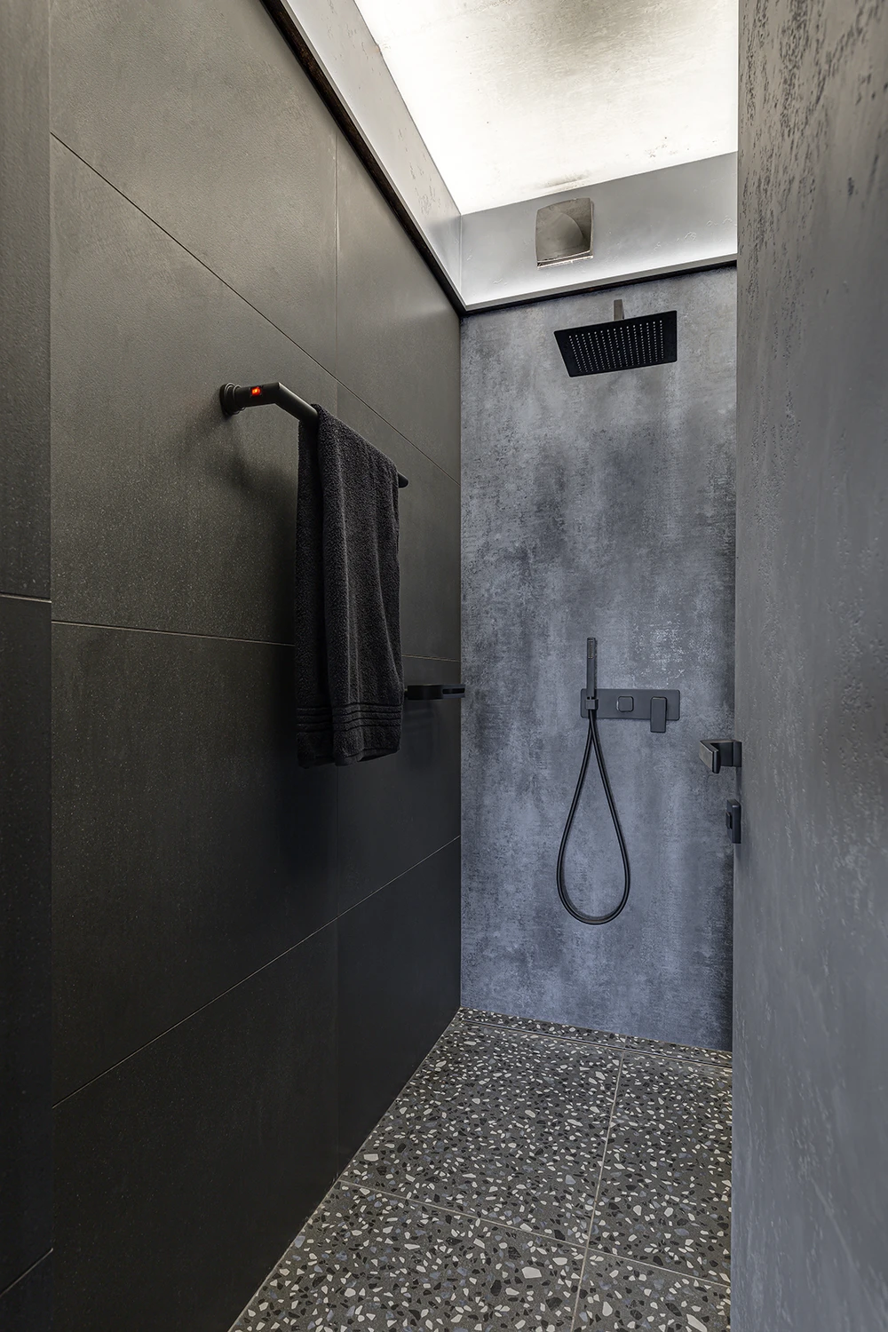
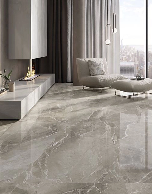
Trend 4. Grey as the Dominant Color
The grey scale has long been a symbol of modern minimalism, restrained elegance, and “expensive calm.”
But it also has its “pitfalls,” especially when the grey palette dominates the interior. Here’s why this trend often doesn’t work in real life:
1. Psychological fatigue
But it also has its “pitfalls,” especially when the grey palette dominates the interior. Here’s why this trend often doesn’t work in real life:
1. Psychological fatigue
2. Lack of “live warmth”
3. Difficult to combine
4. “Instagrammability” vs. life
When grey works:
CONCLUSION: Grey is not a mistake. But total grey is no longer about modernity, but about the lack of choice. If grey was once the “new white,” now it is rather a backdrop for complex interpretations, not an independent style.
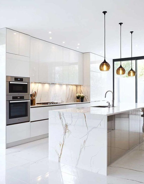
Trend 5. Polished “Marble-Look” Flooring
This is another striking example of a trend that is often impressive in photos but does not always justify itself in real life. This is glossy tile, porcelain stoneware, or self-leveling floors imitating marble, often with a very pronounced vein pattern and mirror shine.
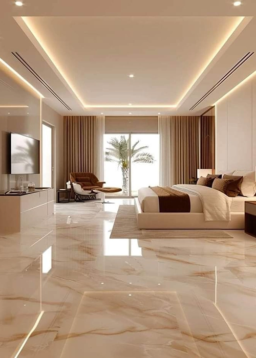
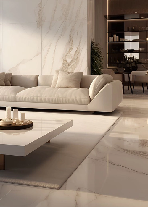
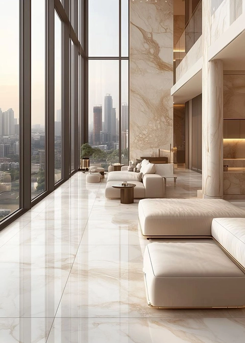
WHY IT DOESN’T WORK IN PRACTICE:
1. Slippery surface
1. Slippery surface
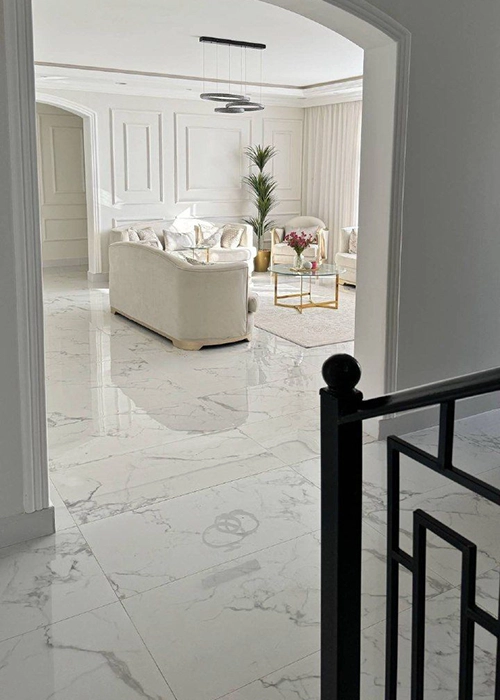
2. Cold to the touch
3. Every stain is visible
4. Too “ceremonial”
5. Problems with combination
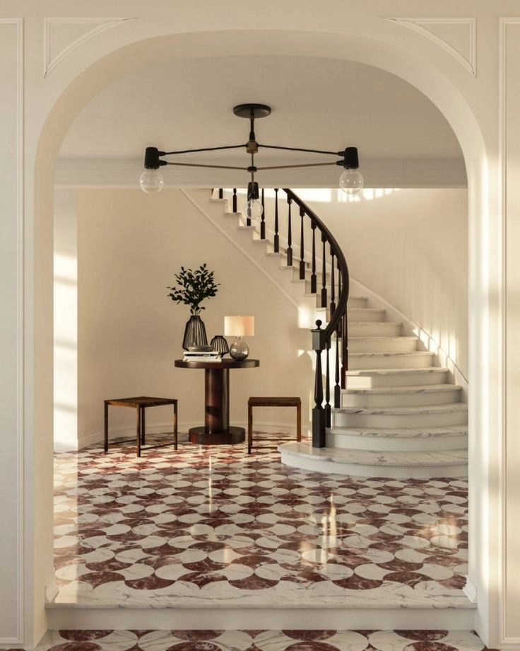
When it can work:
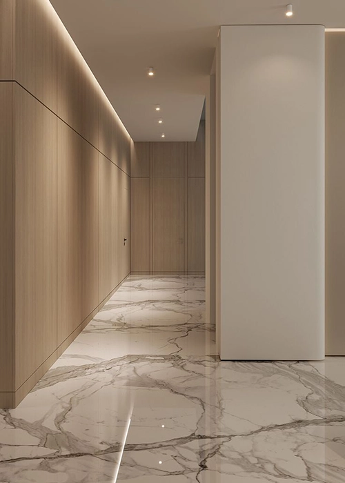
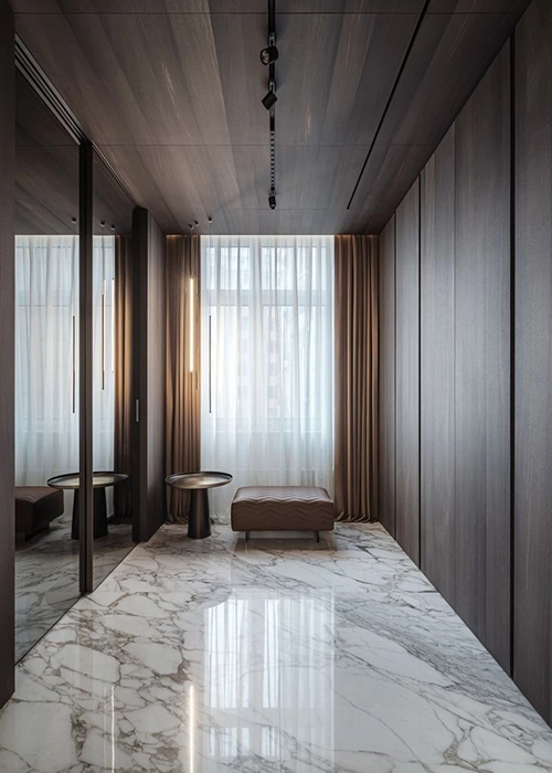
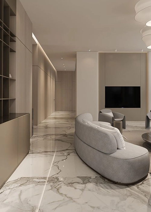
🌿 Alternative
At Modificat, we don’t fight fashion — we know how to adapt it. So that it serves you. And does not stop being beautiful even in reality.
Do you want an interior that won’t go out of fashion in a year and won’t make you regret it? Write to us — we will discuss what truly suits you.
Do you want an interior that won’t go out of fashion in a year and won’t make you regret it? Write to us — we will discuss what truly suits you.